2 minutes
🎨 My new logo
This is my new logo which I mainly made as a favicon for this site.
How I came up with it
Actually it was a pretty quick prototyping and I kind of like the result. It is not perfect, but better than my old logo which looked like this:
What I actually did to make the new logo happen is that I used Gravit Designer and opened a new 512 by 512 pixel document. Then I started with a circle in a color I like (#9900FF). After that I just wrote an N in a text element and went through the different fonts. The font I finally landed on was Bungee Shade. I centered it and then I converted the font to path.
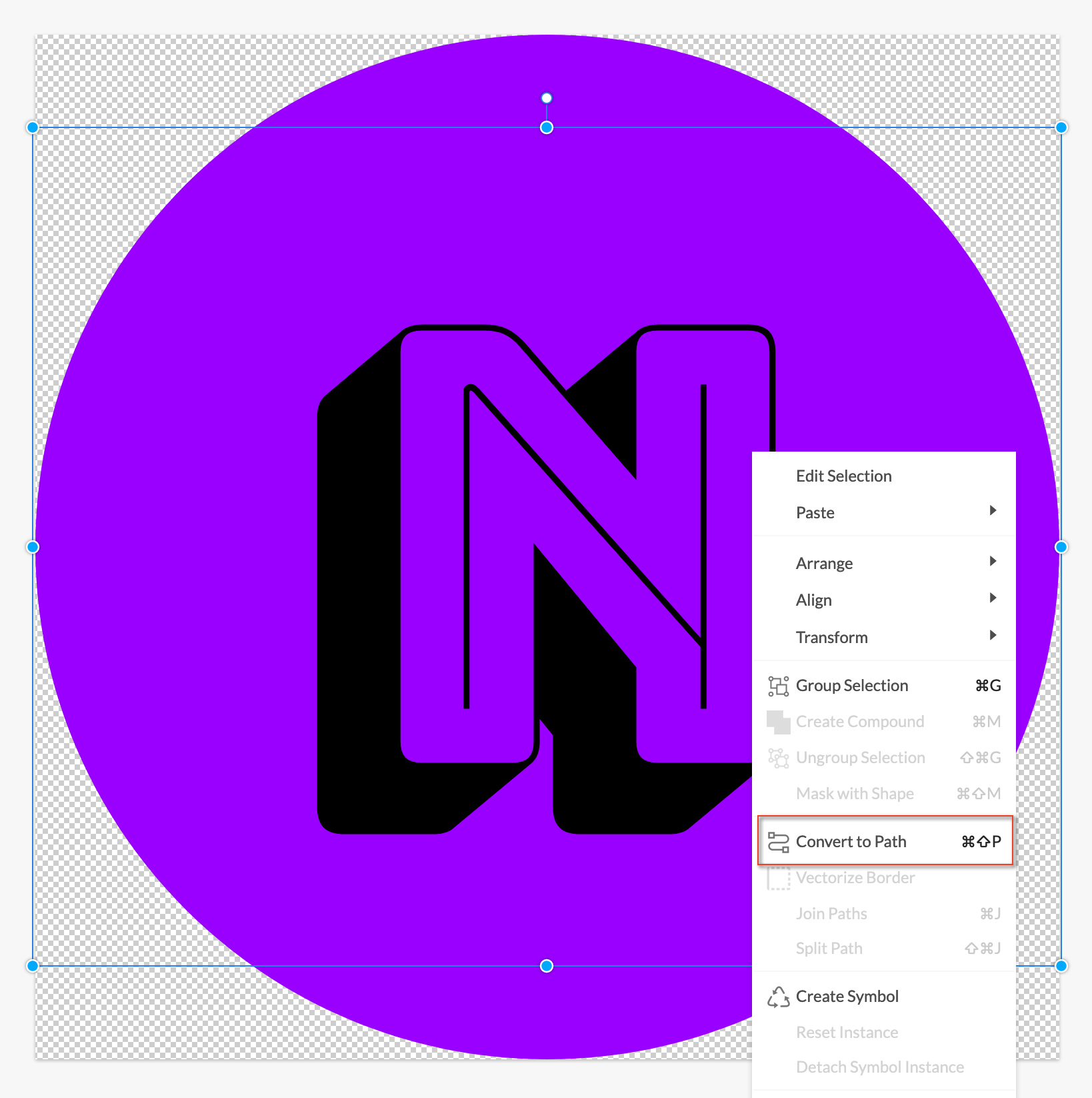
After that I had a compounded path which I split it up.
Then I just reordered the paths, grouped them and changed the color of the inner shape to white. That was it.
Then the only thing left to do was export it as a png and upload it to realfavicongenerator.net to generate all the necessary files for use as a favicon.
Conclusion
I think Gravit Designer is a really fine tool to do stuff like that. I even got a subscription for the service which is way cheaper than Photoshop or something like it and I can use it on Linux and macOS!
Cheers 🍻